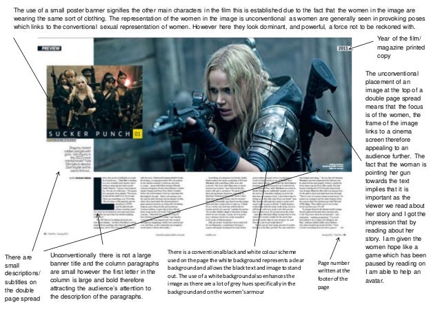
Since the research I made for examples of media magazines and film posters, I decided to start analysing an example of media magazine and film poster to see how these two ancillaries fit with the genre of their films.
The first example below is a double page spread of a magazine article I am hoping to take inspiration from for my media magazine. The layout overall of this double page spread is very good and is giving plenty of information to the reader about a personal review of the film by a trusted author, There are also small subtitles under each of the pictures to describe the pictures or even quote what the scenes from these films are hinting to the audience. My personal complaint about this magazine spread however is the lack of pictures and bright colours which make the spread more appealing at first glimpse to the reader.

The next example is a film poster which I also like very much. Despite this poster not being in the minimalist style that I would like my poster to be, I still am a big fan of the use of CGI graphics to mix into this poster which immediately attracts the audience for the themes of this film and what genre it belongs to. I really like the extra details of the film blurb at the bottom which credits the actors involved with the production and the credits for the directors and producers too.

Having analysed examples of ancillaries which I like and have ideas to take inspiration from, I now need to begin creating my two ancillaries starting with the poster.


No comments:
Post a Comment